Patagonia
Patagonia
The power of stories.
Background
Patagonia has been creating bespoke content for years, leveraging the written word as a way to share stories about those living out Patagonia’s mission. Initially published in catalogs, the content migrated over to a digital blog called The Cleanest Line around 2007. In addition to articles, Patagonia started producing more films around their core sports and environmental causes. The content library was growing but did not have a home outside of the separate blog and YouTube channel. We needed a way to centralize the content and make it more discoverable to our audience.
While we wanted to bring the content together, we also were interested in seeing how the content could exist on Patagonia’s e-commerce site. Could our content create a richer shopping experience, or would it simply cause friction and/or be overlooked by consumers?
Project Goals
Incorporate Patagonia Stories into the new site redesign. Create a home for both Stories and Films as well as a plan for dispersing the content throughout the shopping flow.
Challenges:
Migrating existing backlog: Dealing with over 10 years worth of stories (around 2000 articles and 30 films) that need to be sorted through, categorized and reviewed for quality.
Competing content priorities: Our edit team and film team operated independently, each with their own priorities. We needed to balance priorities of both teams so content was featured equally.
Fitting into the merchandising matrix: We needed to collaborate with the sport marketing and merchandising teams to come up with a plan for the site that would not only feature our seasonal marketing campaigns, but also reserve space for featuring our stories.
Discovery Phase
Before diving into any design, we needed to better understand the body of content we were working with. After looking under the hood, it became clear that the stories had not been organized in a consistent way. The existing category and tag library was monumental. We needed to come up with a consistent group of categories and tags to make the content easier to display in topical carousels on the site and have better SEO.
Categories: We started to come up with a list of categories based on the existing body of work and the future goals of the edit team. When pressure testing the list, we realized that some stories fit into multiple categories (e.g. a story about a climber’s local produce business would be tagged as “climbing” and “regenerative organic”). So we had to come up with a tiered approach to the categorization. Each story could have a primary and a secondary category. The primary category carried more weight than the secondary category when ranking the content in a carousel, but allowed the story to show up in multiple places.
Tags: In addition, each story could have tags. We needed to pare down the existing tag library and make some rules around what could be added as a tag and what the purpose of a tag was. Tags were used for opportunistic categorization, such as for campaigns or seasonal needs. To manage inevitable bloat, we set a rule that in order to add to the tag library, approval was required by the lead editor.

Configuration & Migration
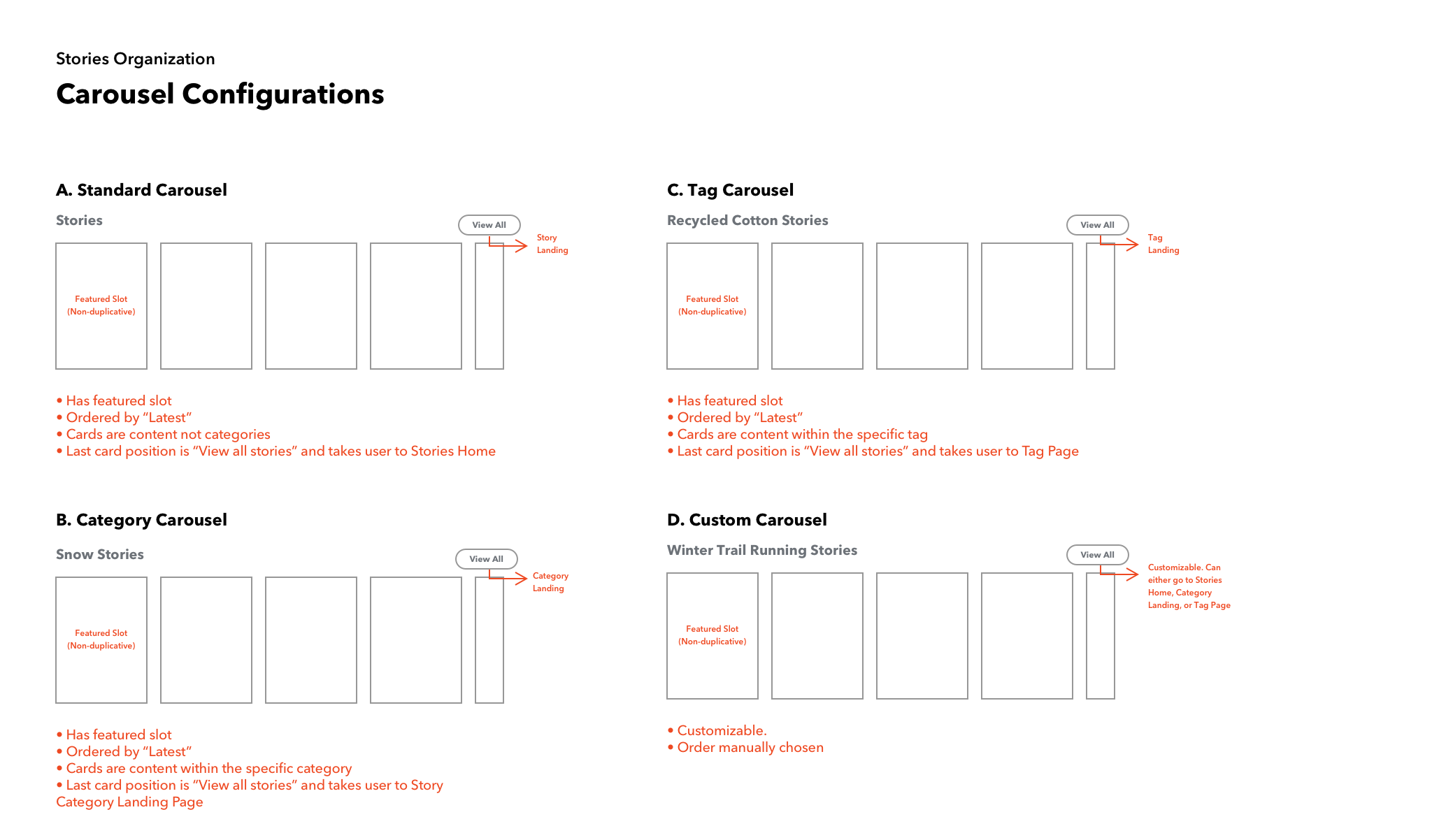
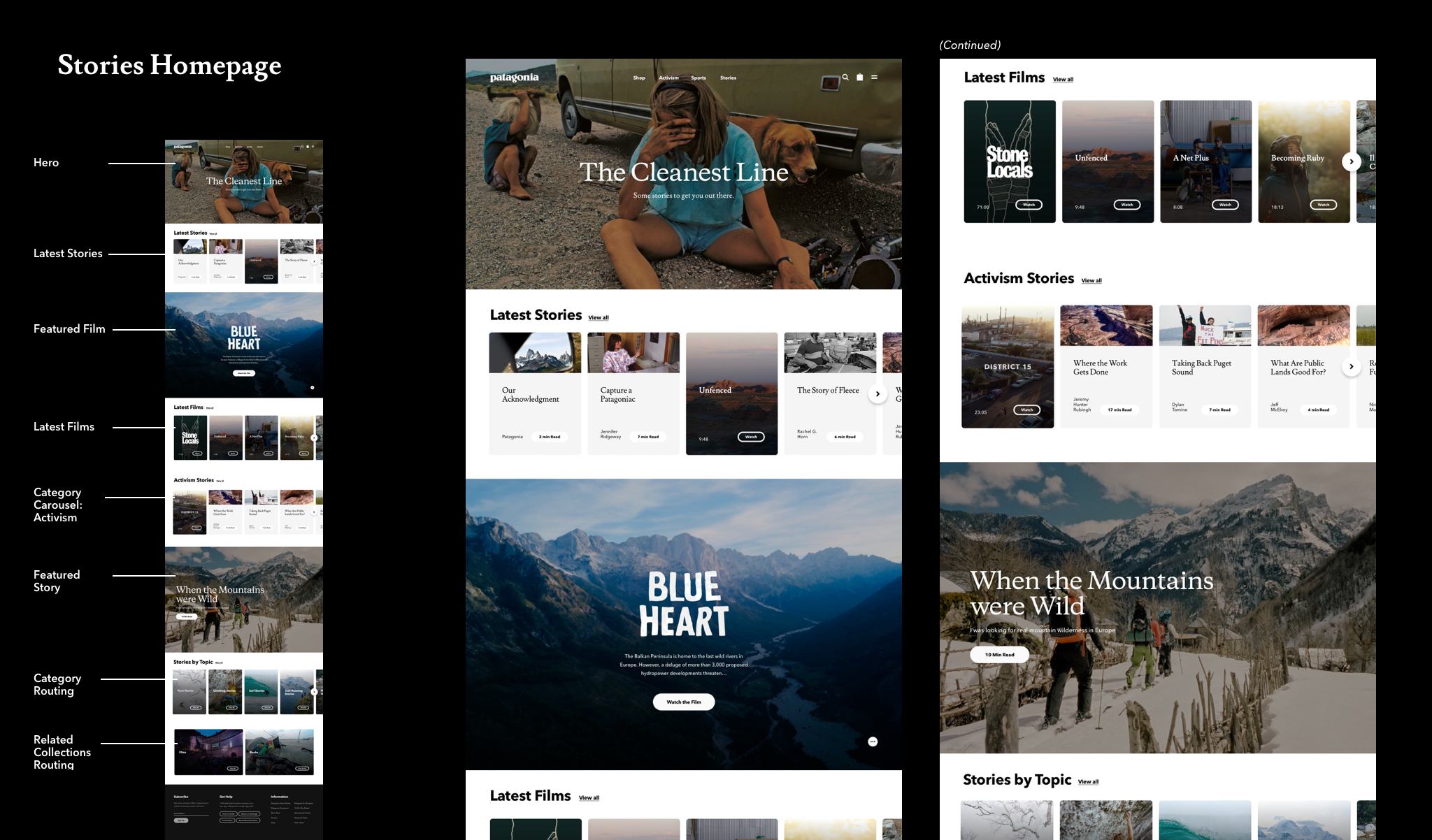
Configuration: With categories and tags in place, our stories could now be grouped in a variety of ways, allowing us to serve up contextually relevant content across the site. Each story (article or film) would be represented as a card and cards would be arranged into carousels. Each card would link the user over to the content detail page where they could read or watch the content piece in its entirety.
We created a library of different story carousel configurations to be applied across the site. Carousels could be grouped by a category, a tag, latest publish date, or manually to create a custom grouping. To make the carousels smarter, I worked with my partnering developer to come up with a ranking system for the cards pulled into the carousel, balancing the importance of featured stories, recency and relevance with a point system. If stories matched on a primary category, that equaled 15 points. If they matched on a tag, that equaled 10 points. If a story was featured, add one point etc. This created smarter carousels that ideally served up content that was more relevant and interesting to a user, encouraging them to continue browsing.
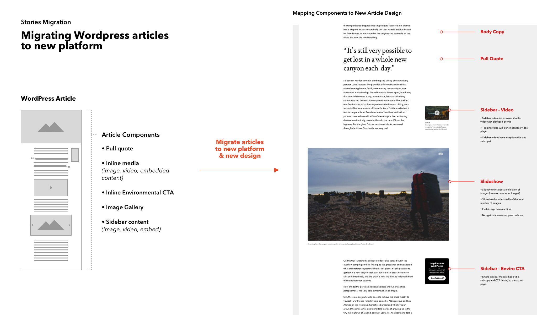
Migration: Given all the stories existed on WordPress, we needed to migrate all the existing stories over to our new platform. In order to make this seamless, we needed to have 1:1 content components so no content would be lost. For example, if a story in WordPress had a slideshow module to show images, we needed to build a slideshow module on the new platform. I initially did an audit of the components on the WordPress site and designed components with mirrored functionality but an updated style. In addition, I consulted with the edit team on what additional components they want to make their stories richer.
Detailed Design
With the components in place, it was time to bring it all together in the page layout. There were a lot of pages to account for in this project, with differing goals:
Bespoke Landing Pages:
Stories Landing Page
Film Landing Page
Goal: Our stakeholders wanted this page to showcase the depth and breadth of our content and feel fresh to returning users. We constructed the pages to have a balance between manually featured content (cherry picking the best of the best) and dynamically updated content (keeping things fresh without our intervening).
Automated Landing Pages:
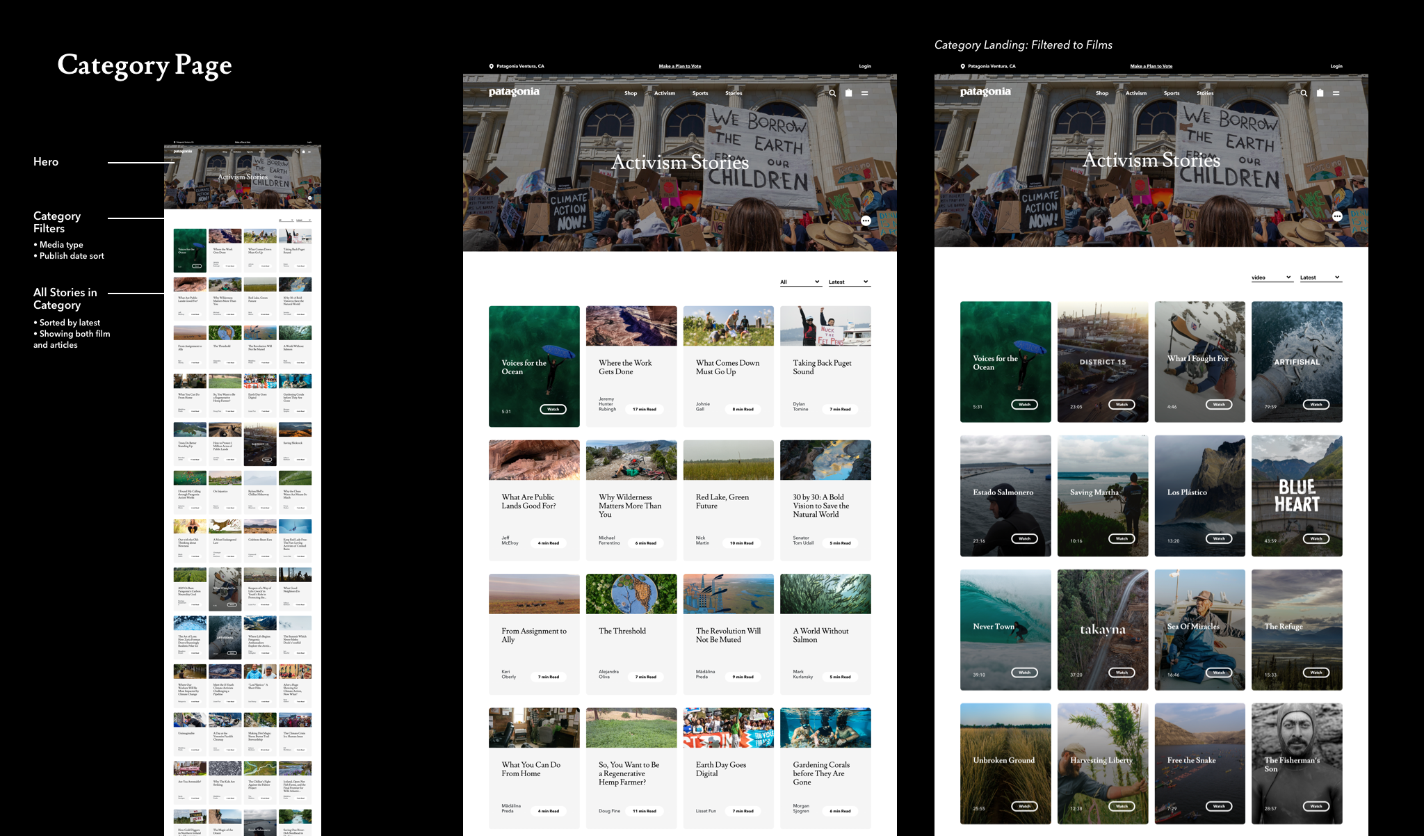
Category Landing Page
Tag Landing Page
Goal: Pages built around a specific category or tag needed to be easily browsable by media type. In addition, we needed to account for the varying levels of stories per category and tag, ensuring that a page with only 8 cards would work as well as a page with 80 cards.
Content Detail Pages:
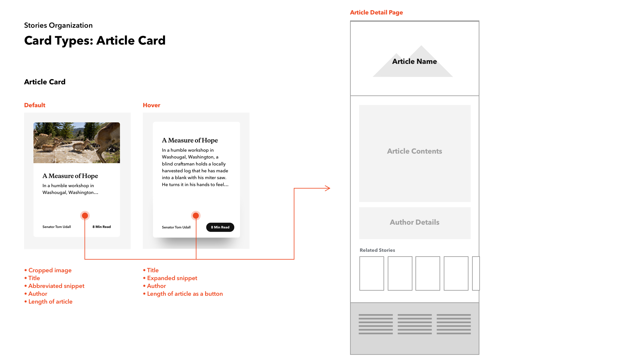
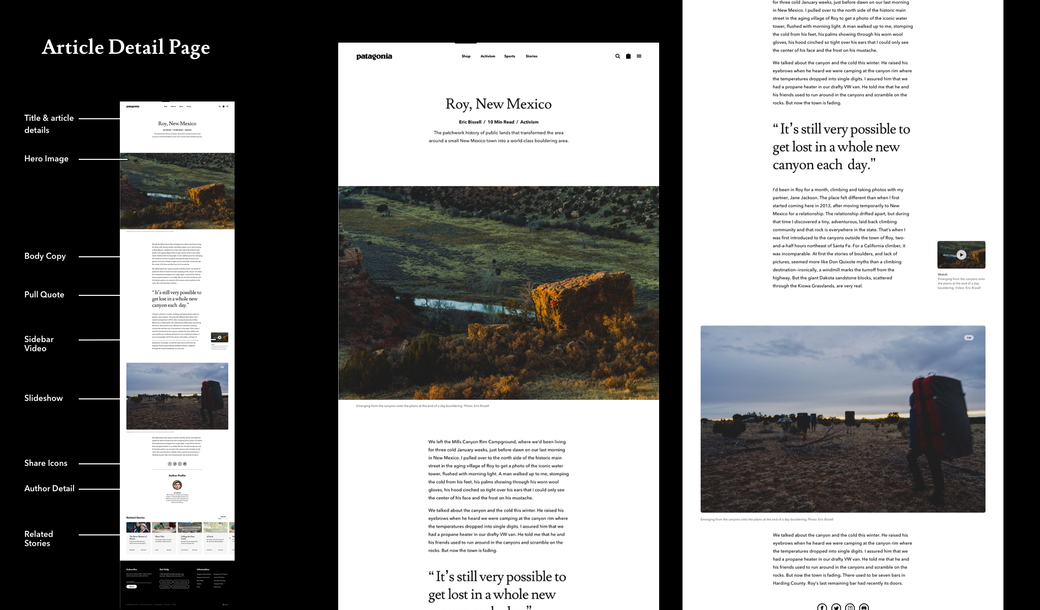
Article Detail Page
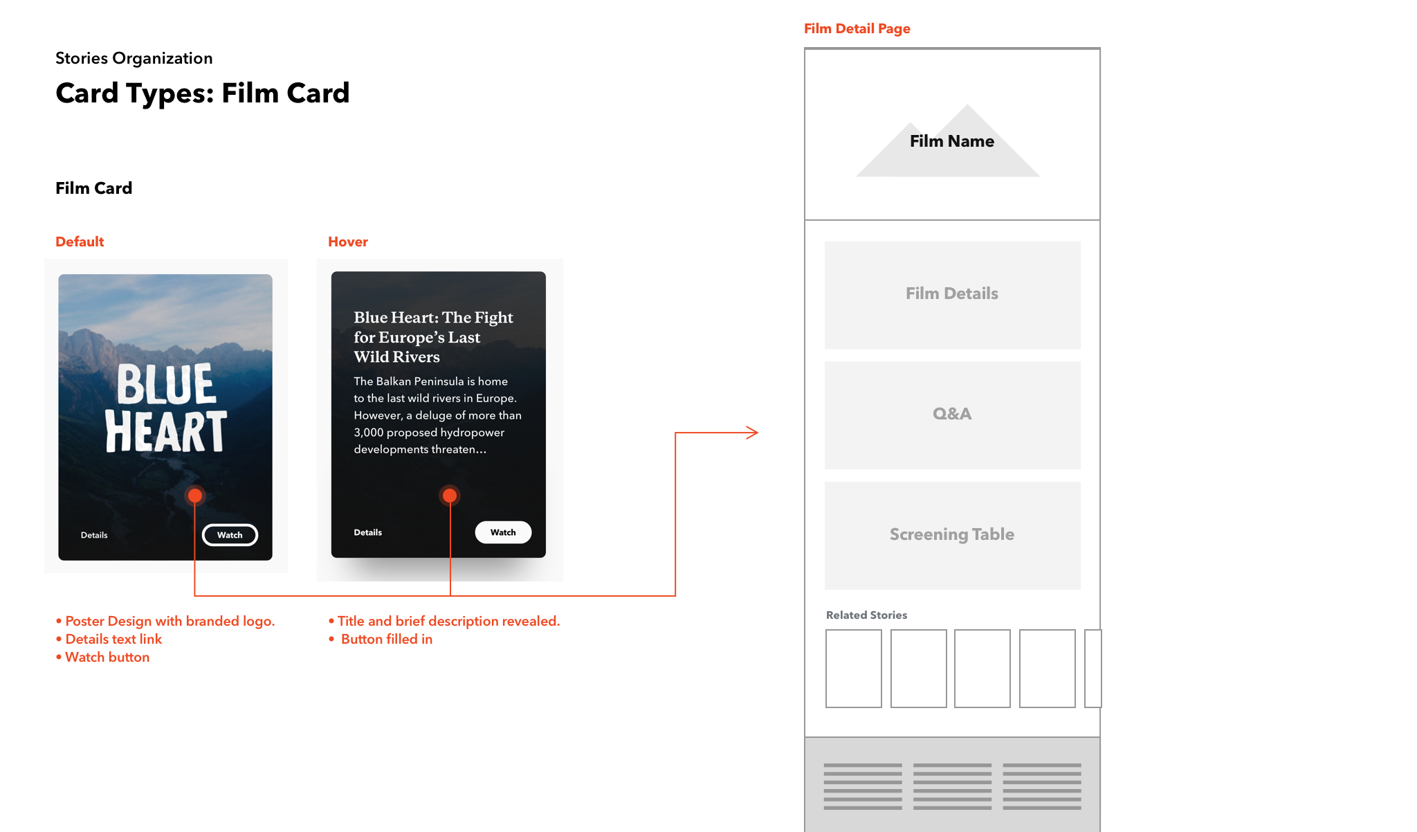
Film Detail Page
Author Detail Page
Goal: Similar to the automated landing pages, these pages were designed to flex, working perfectly for a short and sweet story with a few paragraphs and a hero image, while also able to accommodate a long-form feature piece. I designed a toolkit for the detail pages that the content editors could leverage as they constructed their story.
Stories Across the Site
Outside of the Stories homepage, we wanted to create space for story content to live alongside marketing and product information. For launch, we decided to add stories on the homepage and on the Sport community pages.
Homepage: We worked with the marketing and merchandising team to come up with a rubric for the homepage that reserved one slot for a featured story followed by a carousel of the latest stories published. The goal was to increase awareness of the fact that we publish stories and ideally increase the traffic to the Stories homepage.
Sport Community Page: Our sport pages were another perfect place to provide contextually relevant stories. Each sport team could select either a featured story and/or a sport specific carousel of stories to add to their community page.

Post Launch
Guidebook: In order to better ensure consistency and quality in the content we were displaying on the site, I built out a 50 page guidebook of rules and best practices for publishing a story on our site. This served as an invaluable resource for the edit teams, as well as a great reference for the partnering PM’s.
Shift towards stories during pandemic: Not long after the launch of the new stories platform, the Covid pandemic hit. As a company we shut down our offices, stores, distribution centers, and website in order to keep all employees and their families safe. With the stories infrastructure we’d launched we were able to shift our site from an e-commerce focused site, to a story-focused site. Our homepage only featured story content, all email marketing directed users to stories, and we added more contextual story carousels to shopping pages. With a new level of attention placed on this hub and a growing amount of user traffic, we were able to leverage data to tweak how we were displaying our content.
Some updates during the website shutdown:
Create more routes back to the Story landing pages. Since we were linking users directly into a detail page from our emails, we needed to ensure that they were able to get to the Stories homepage easily to see what other stories we had to share.
Route after reading: We added additional routing at the end of article and film detail pages that include routing to landing pages, category landing pages, and related stories.
More curated content: Add more curated content carousels in lieu of dynamically updating carousels on the Story landing page to provide added value for the user. This also allowed us to pull some “Staff picks” to the surface that included much older stories from the archives that might have not been surfaced otherwise.
