McDonalds
McDonalds
Fast Mobile Ordering
Background
The perceived added value of the McDonald’s app was not clear to the core user base. Users were using the app primarily to access deals, not to place a mobile order. The ordering experience in the app had not proven itself to be any better, quicker or more enjoyable than simply ordering from the counter or drive-thru. How could we make the app the fastest way to get your meal, your way?
After chatting with stakeholders across the global markets and by analyzing data points throughout the flow, the consensus was clear: ordering on the app was not obviously the better choice. Why would a user order on the app?
Design did not encourage browsing.
Selections and available modifications were not clear or consistent across product.
No quick paths to the classics or a previous order.
Project Goals
Allow users to build their mobile order more efficiently resulting in decreased drop - off rate and increased check size. Create a frictionless ordering experience that guides first time users and expedites repeat users. The end goal was to decrease drop-off and improve MOP order submission by 5%
With the potential to affect so much of the app, we developed a phasing plan for the work.
Build the Foundation: Optimize the flow to get users through faster. No back-end changes or change to taxonomy.
Improve key experiences: Smarter, contextual merchandising based day-part (breakfast, lunch, dinner) or popularity and expediting common customizations.
Personalize: Add a layer of personalization in the flow based on previous encounters, anticipating the user’s needs.
Discovery Phase
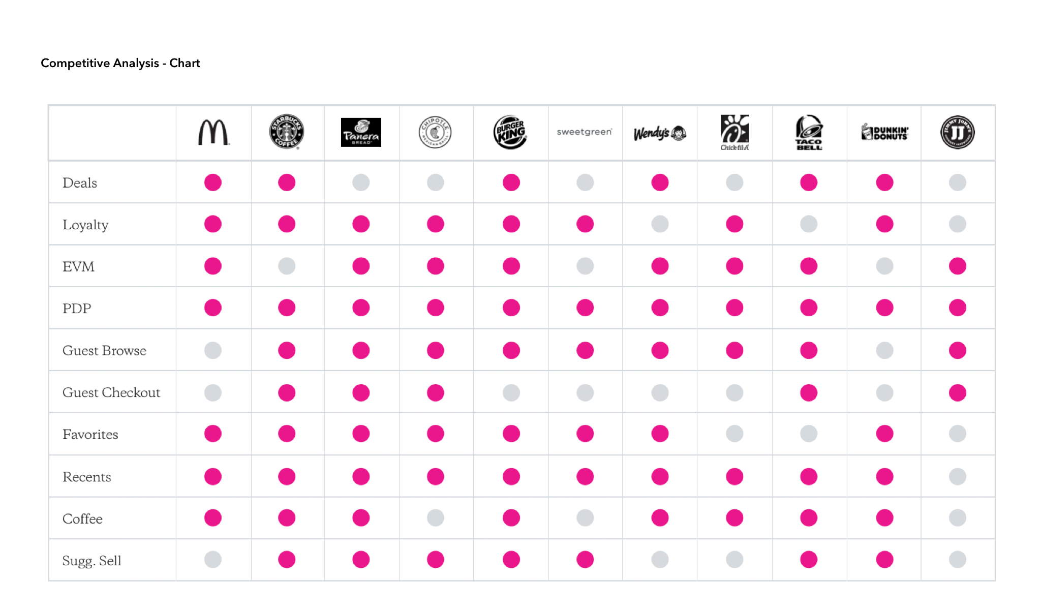
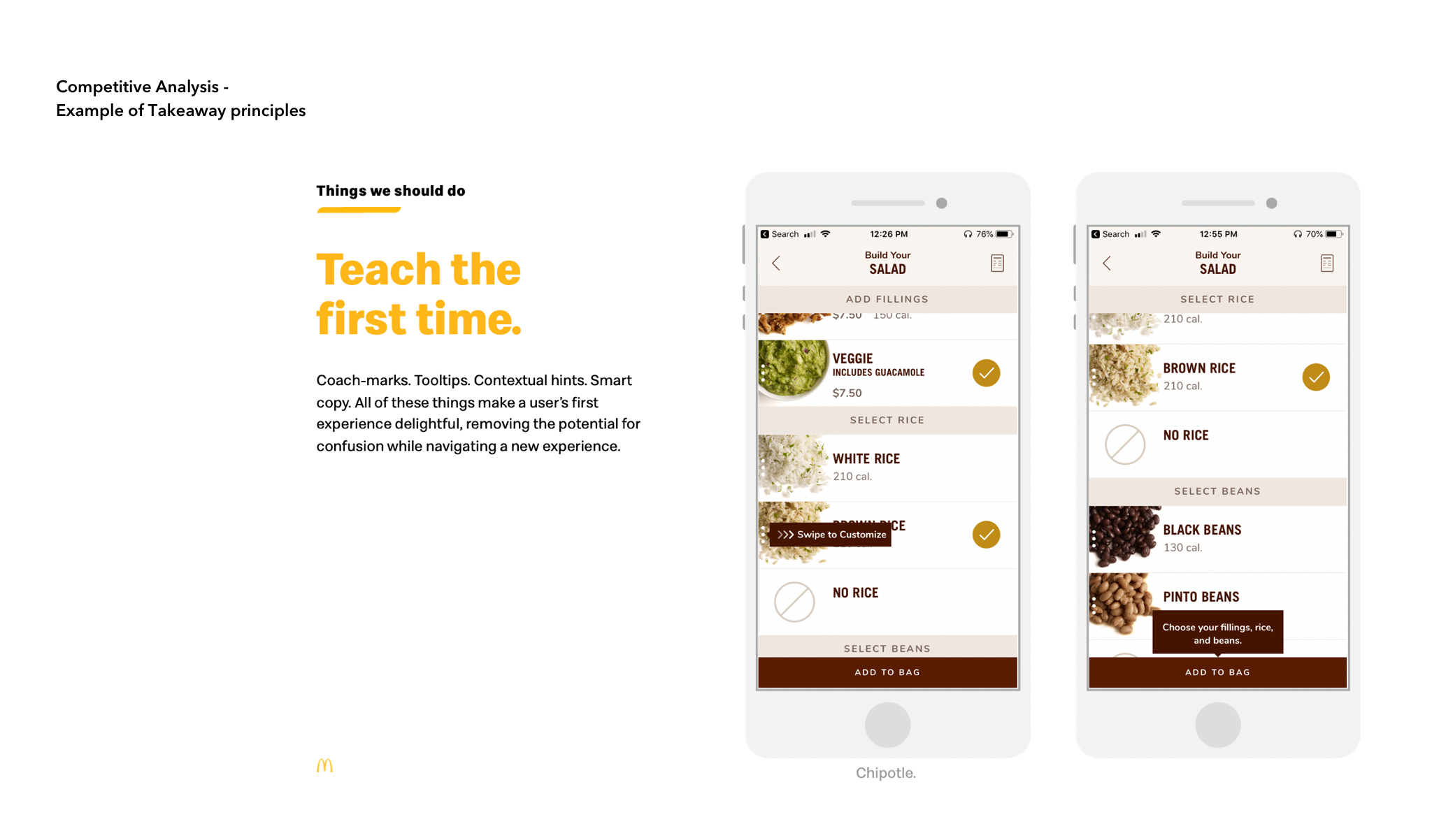
We first embarked on an extensive competitive analysis. Instead of just creating a checklist of comparative features, we assessed the competitors (in QSR and ecommerce space) based on common user scenarios: Browsing, Ordering, Payment. We then created a rubric for scoring the experience to avoid personal bias. The assessment was laid out in a comparison table “cheat-sheet” for easy reference.
Armed with inspiration from the competitive analysis, our team embarked on some high level brainstorming of core issues in the flow -- remove too many limitations, letting our creativity run wild. Two areas of focus were:
Explore an experience that offers multiple ways of browsing (deep browsing and shallow)
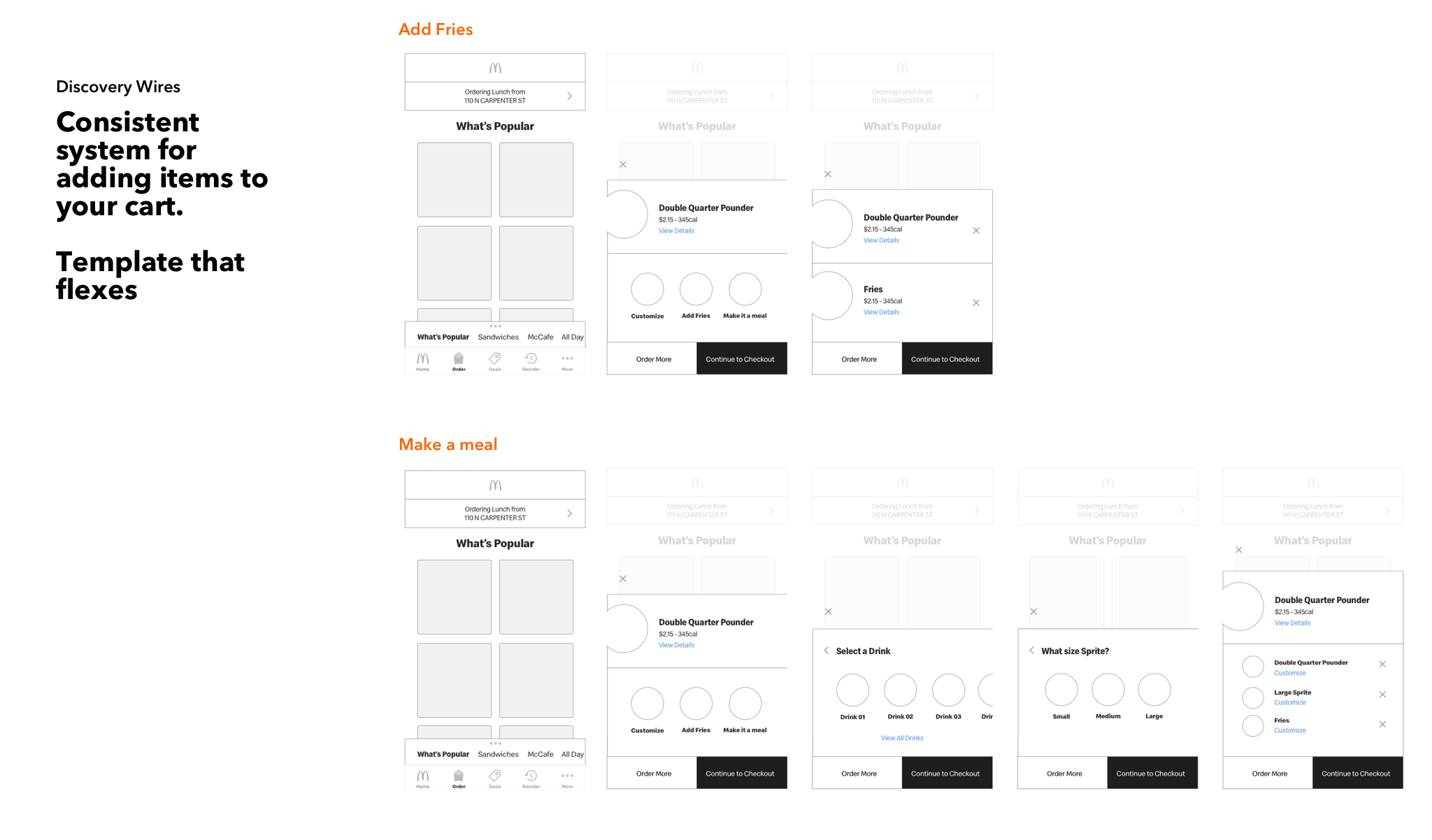
Explore a system that offers consistency in ordering across all items. It can flex for more complicated items (i.e. Big Mac Meal vs. Small Coffee)


Prototyping & Research
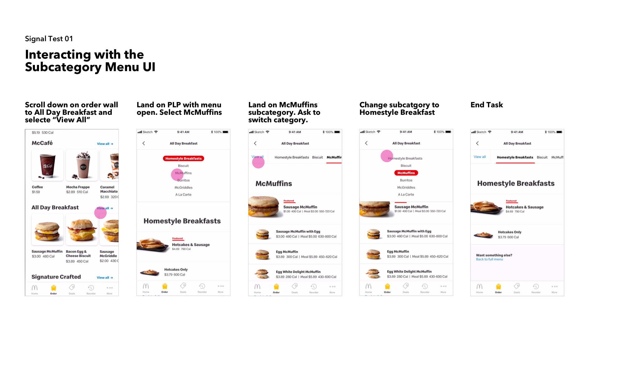
Once we had gotten a rough idea of a user flow out, we partnered with our research team to build out a usability test. I helped design and build prototypes for 2 signal tests.
Test 01: The first test was less about analyzing the whole flow, and more about those complicated moments within the task flow.
Test 02: The second test was a bigger lift, prototyping more refined flows. Here we were looking for overall comprehension and delight throughout the whole flow, noting points of confusion to refine.

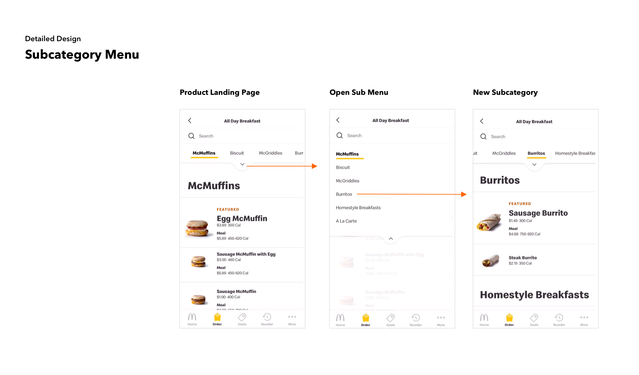
Detailed Design
With the data from our signal tests, we were able to move more confidently toward detailed design. For the first phase deliverable, our focus was on:
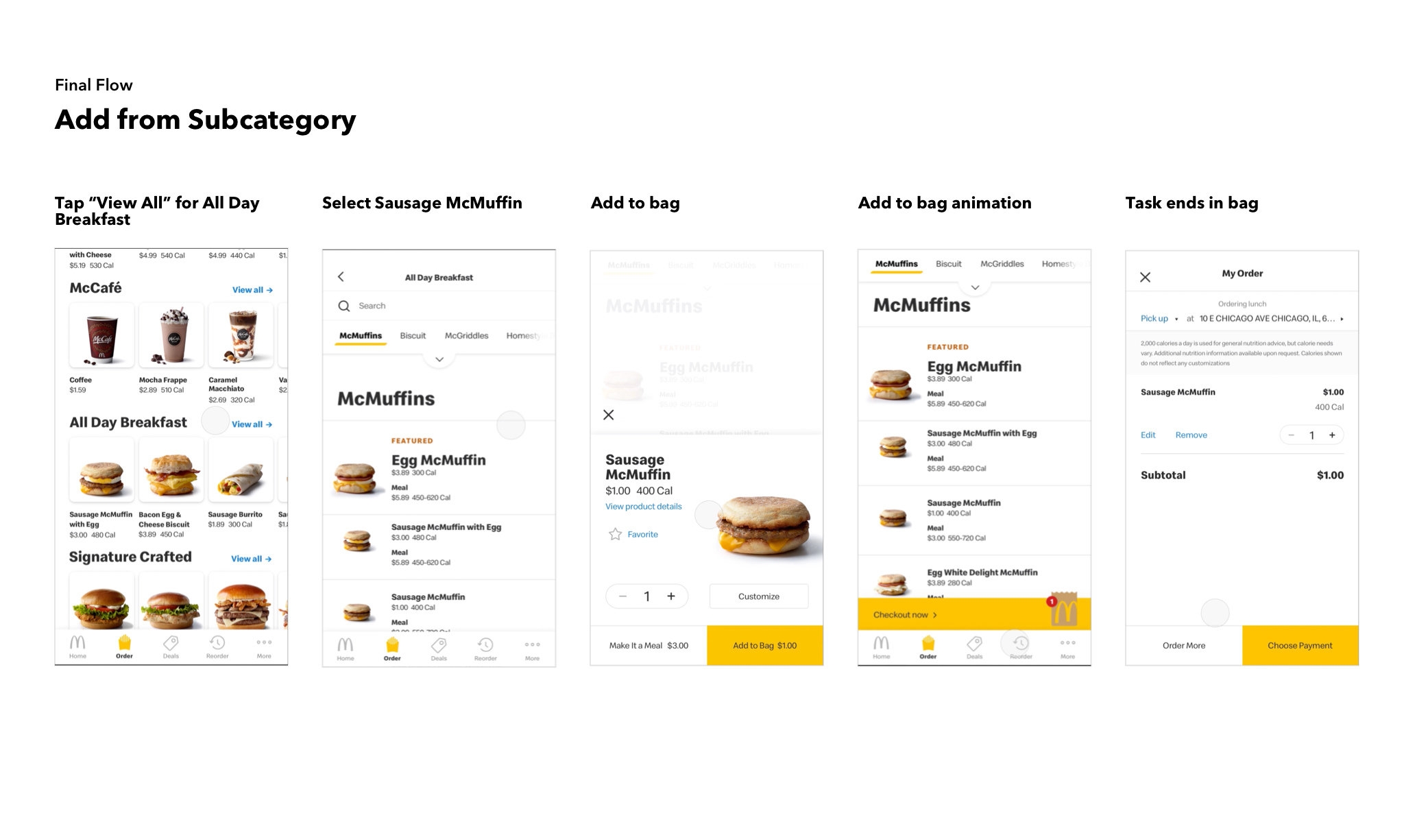
Browsing: Updates to the order wall and to the product landing page
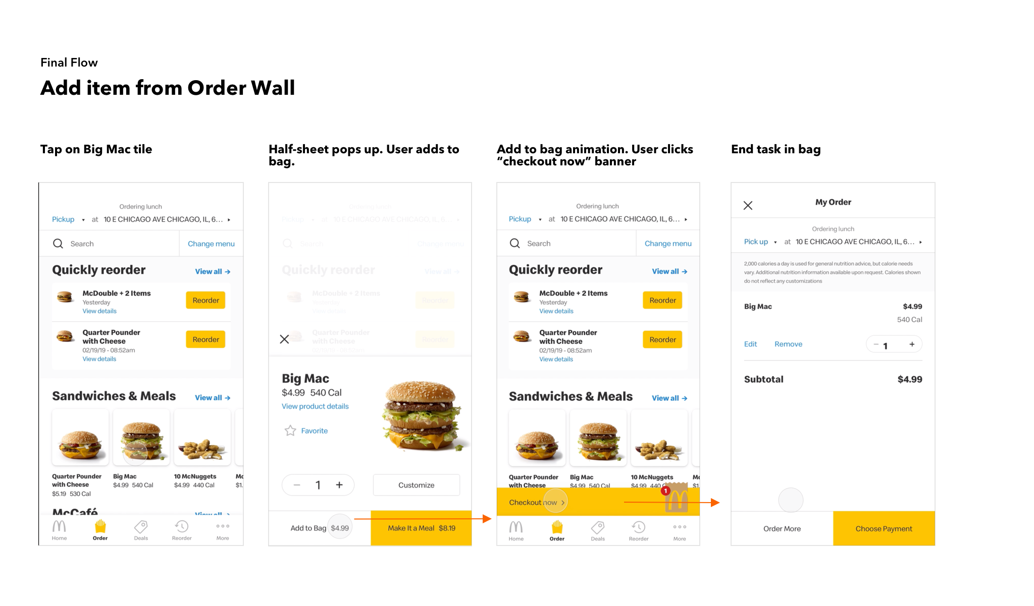
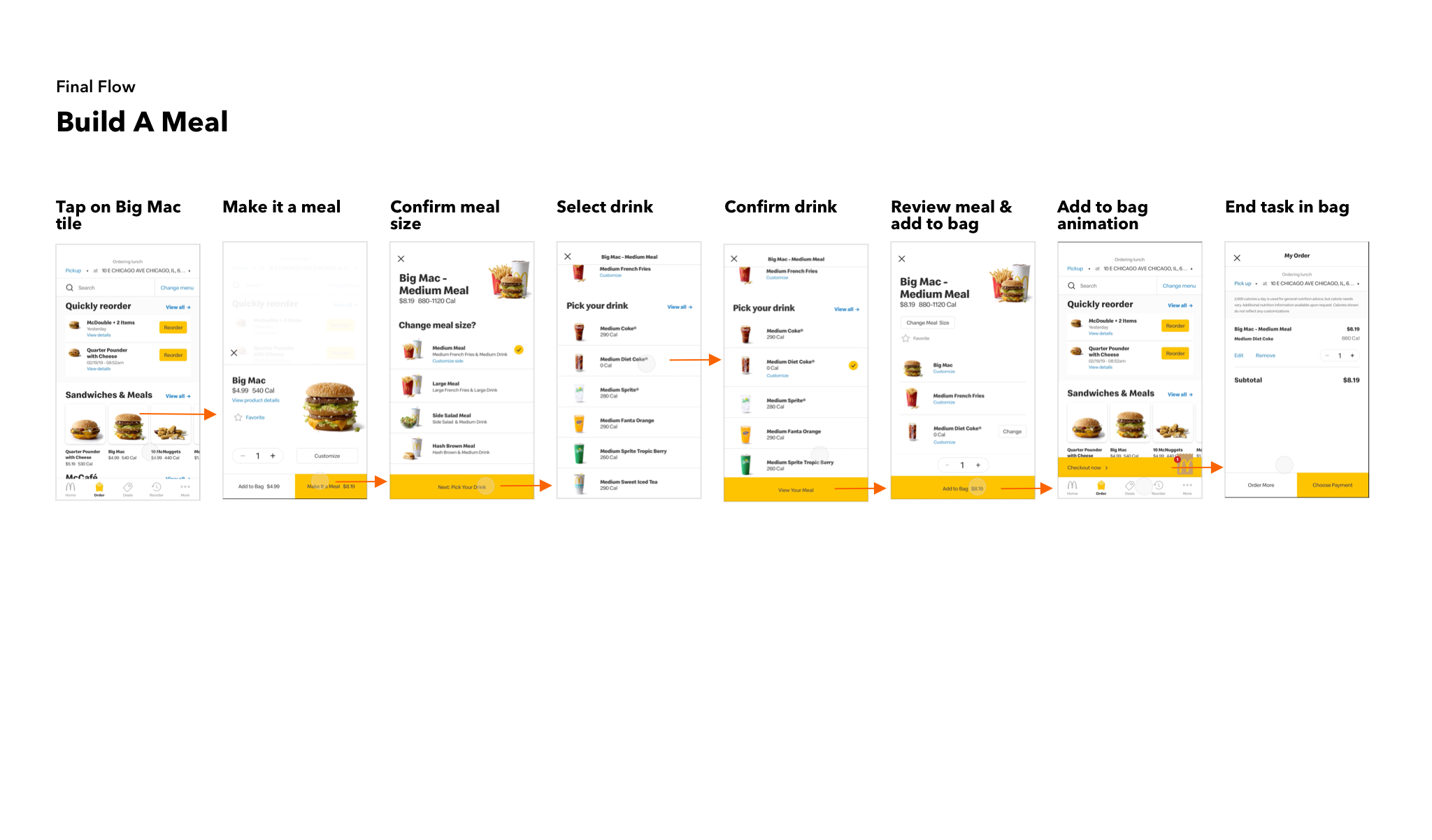
Ordering: Updates to how both single items and meals are added to the bag.

Final Flows
For final review with the client, we built out key scenarios to showcase the successes of the new design.
Flow 01: Quickly add something to bag
Flow 02: Meal building flow
Flow 03: Easily browse subcategories